ENT Intranet
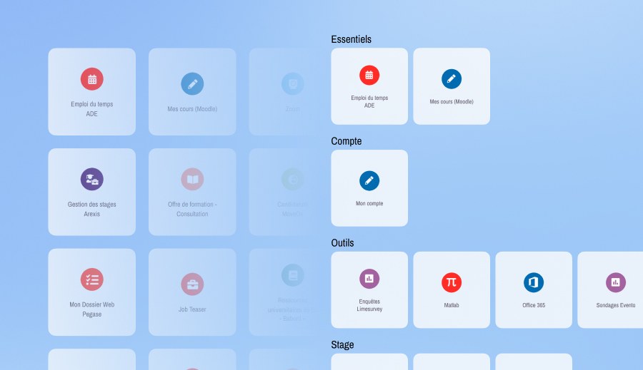
Problem: The Bordeaux INP student portal displayed 33 different tools in a single, unorganized grid. Finding the right service was frustrating because nothing was grouped by theme, forcing users to scan the entire page every time.
Outcome: We reorganized the portal into 12 intuitive categories based on how students naturally group them. We also renamed 7 confusing acronyms so users immediately understand what they are clicking on.
The Problem
The university portal had 33 essential tools sitting in a flat grid. Because the layout was based on institutional habits rather than how students think, users had to scan the whole page just to find one tool.
Our Approach
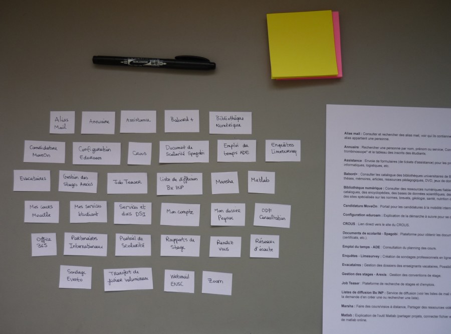
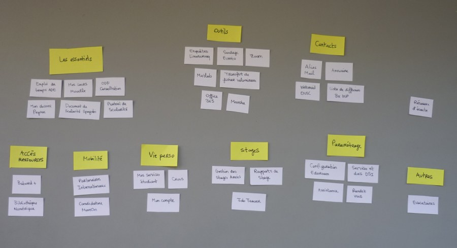
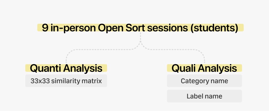
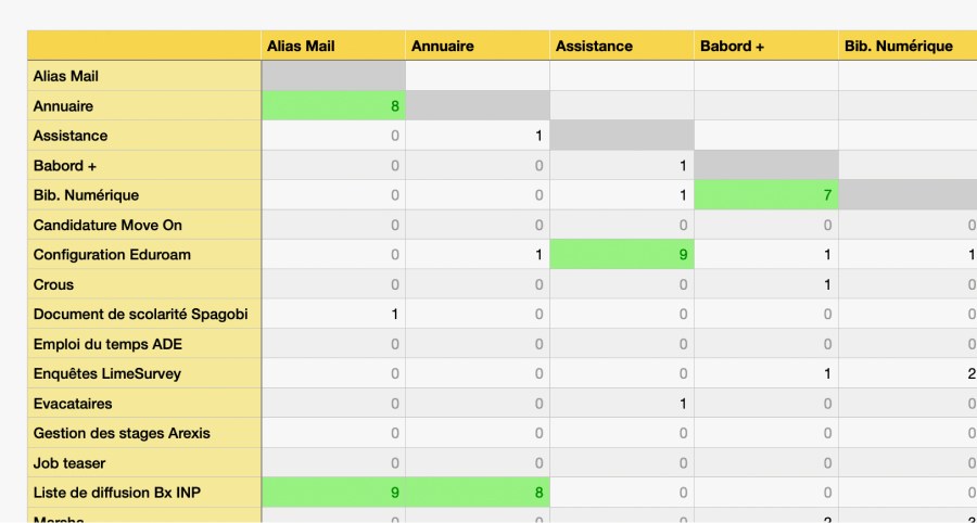
To fix this, I co-led an open card sorting study. We focused on a group of 9 students, since they are the primary daily users, to see how they naturally categorize these services.
What We Found
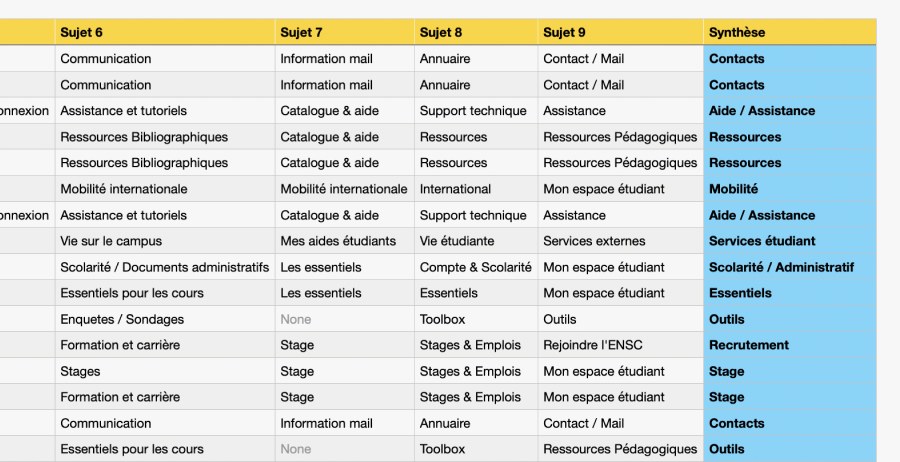
Even with a small group, building a similarity matrix showed clear trends. For example, students almost always grouped their timetable (ADE) with the learning platform (Moodle). This led us to create a dedicated ‘Essentiels’ category for daily tools.
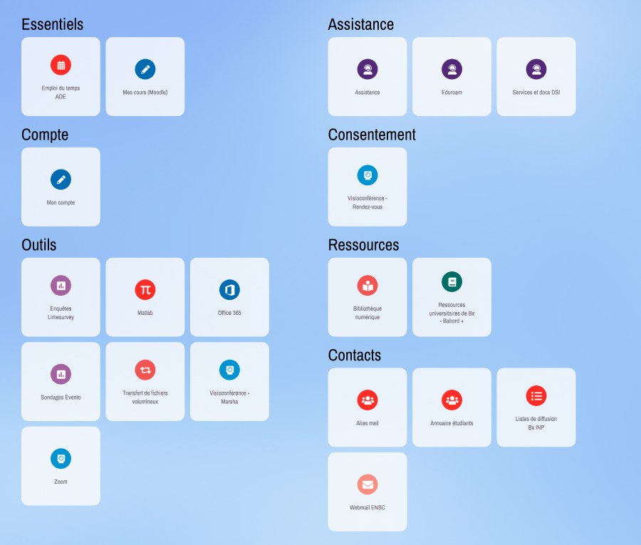
We also found that institutional acronyms and vendor names were confusing. I fixed this by renaming 7 items to describe what they actually do. For instance, we changed the vague ‘Marsha’ to ‘Visioconférence - Marsha’ and ‘ODF’ to ‘Offre de Formation’.
The Solution
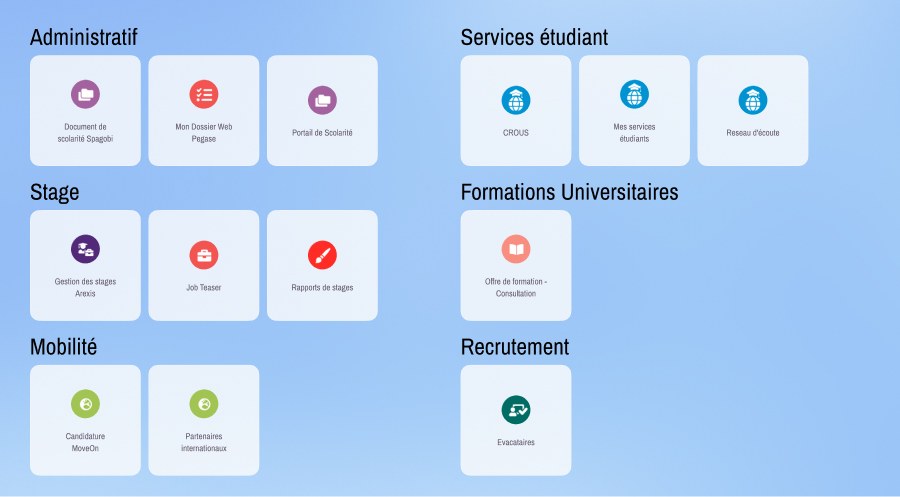
We turned these findings into a Figma mockup. The new design organized the 33 tools into 12 clear, student-validated categories (like Administratif, Mobilité, and Assistance), with everything sorted alphabetically inside.
Next Steps
During the study, some tools like ‘Evacataires’ were left completely isolated because they didn’t make sense to students. Instead of forcing them into the layout, we recommended personalizing the portal based on roles. That way, students, teachers, and staff only see the tools relevant to them.