Koffee
Problem: I had a one-week sprint to design a mobile beverage ordering app for a demanding client who gave minimal initial specifications. The challenge was extracting their hidden business rules and turning them into a functional, user-friendly product.
Outcome: I initially built a functional prototype based on strict client rules. Later, I redesigned the app with warmer colors, a flexible Figma component system, and a streamlined menu that lets users customize drinks without leaving the main screen.
Getting Clarity
I had a tight deadline and very vague instructions, so I led the discovery phase to figure out exactly how the app needed to work.
Agile Discovery
By asking the right questions, I uncovered a few strict rules: the app had to use the brand’s corporate green, stick to three specific sizes, and only allow milk and sugar as add-ons. Knowing this helped me plan the data structure to calculate cart totals and pricing before I even started designing.
Simplifying the Menu
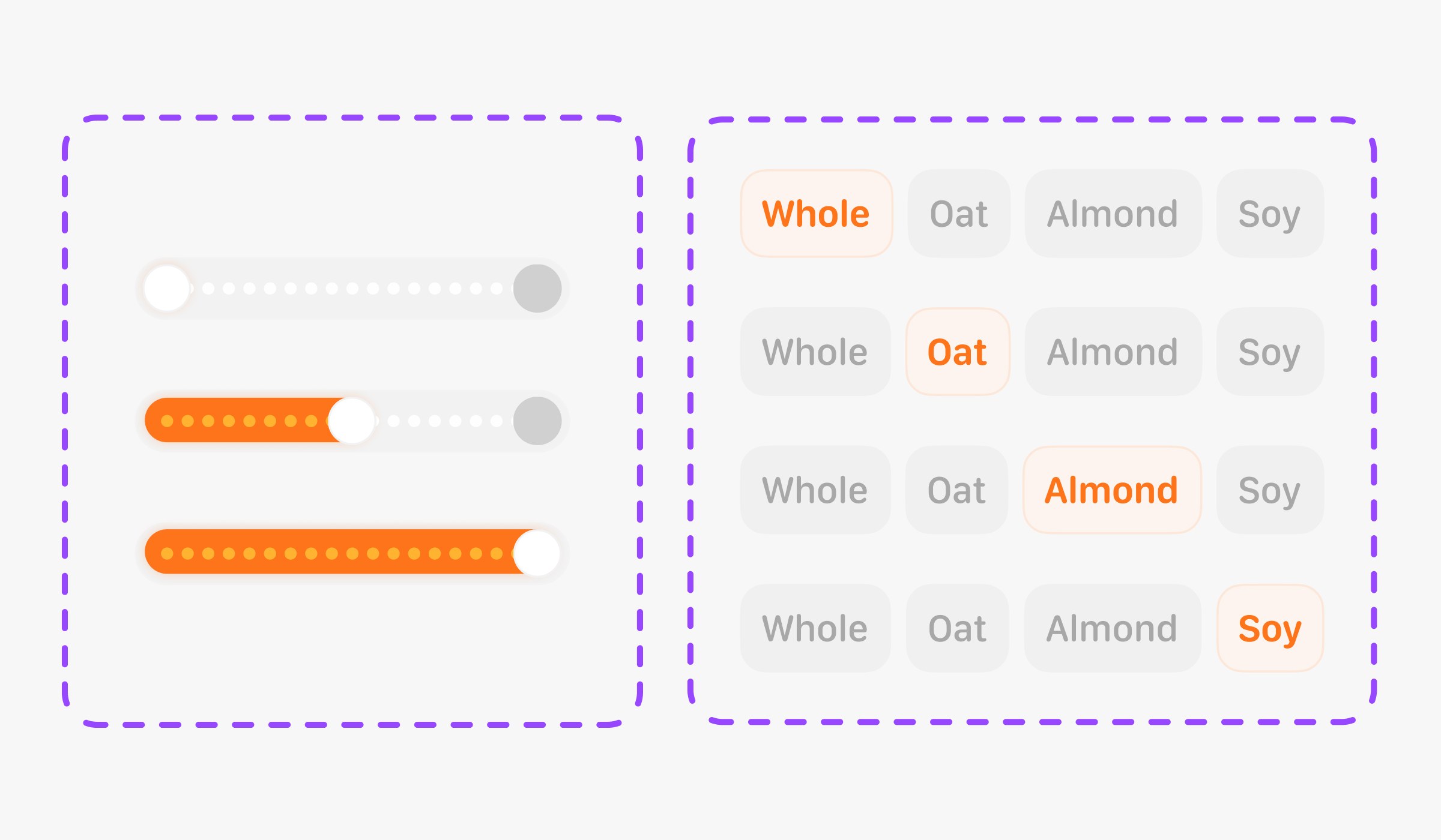
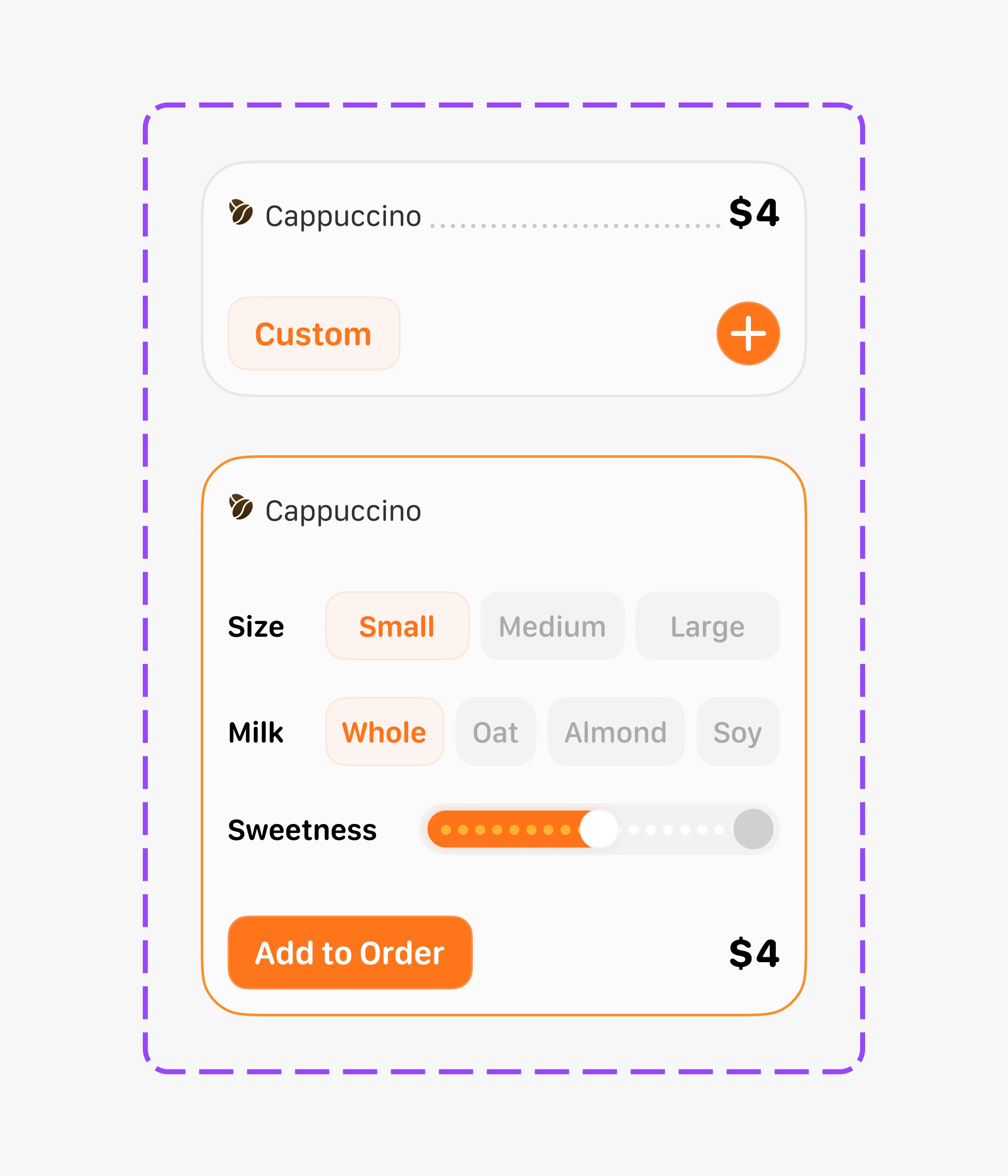
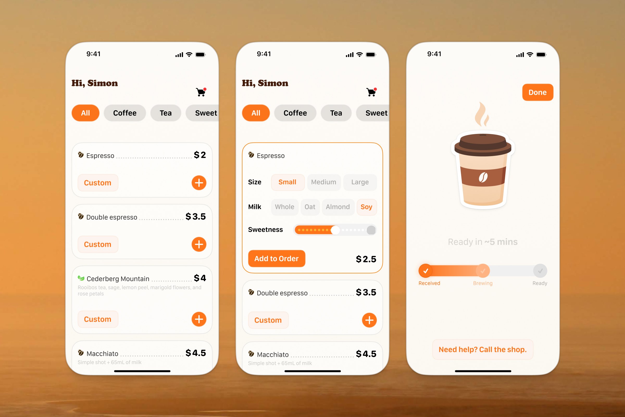
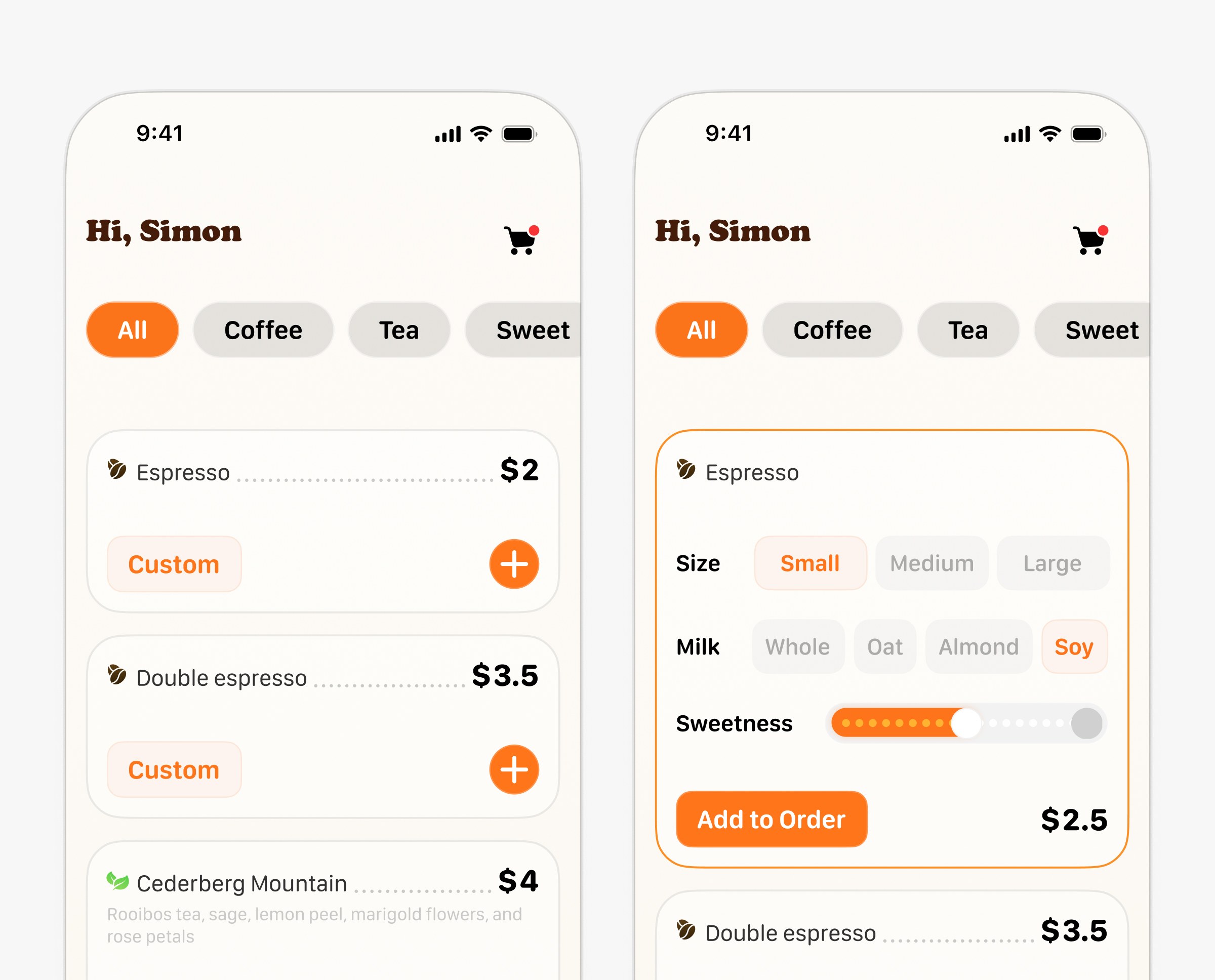
I wanted to make the app as frictionless as possible. Instead of sending users through multiple screens to customize a drink, I added expanding cards right on the main menu during the redesign. Now, people can pick their size, milk, and sweetness using simple buttons and sliders without losing their place in the list.
I also changed the visual style. The original corporate green didn’t feel like a food app, so I swapped it for warm oranges and coffee browns. This makes the interface feel much more appetizing and inviting.
Adaptive Checkout
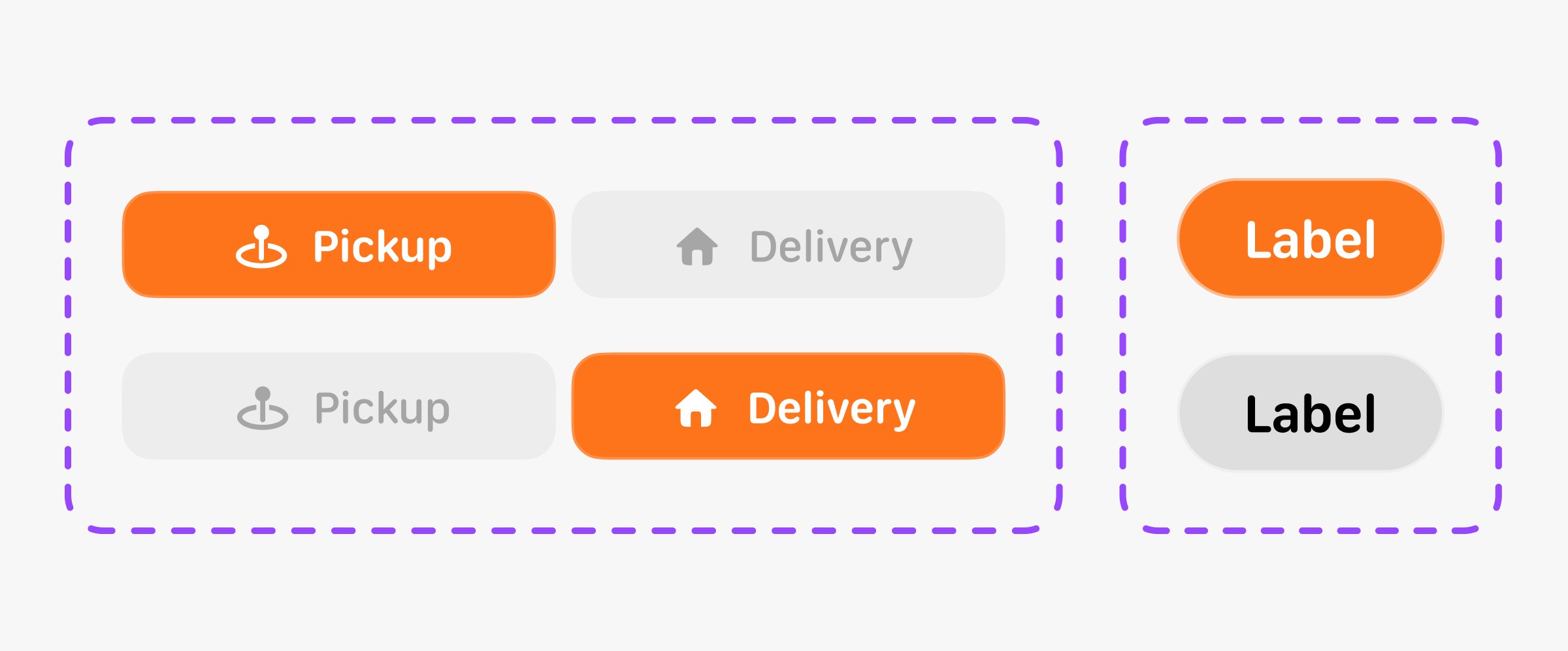
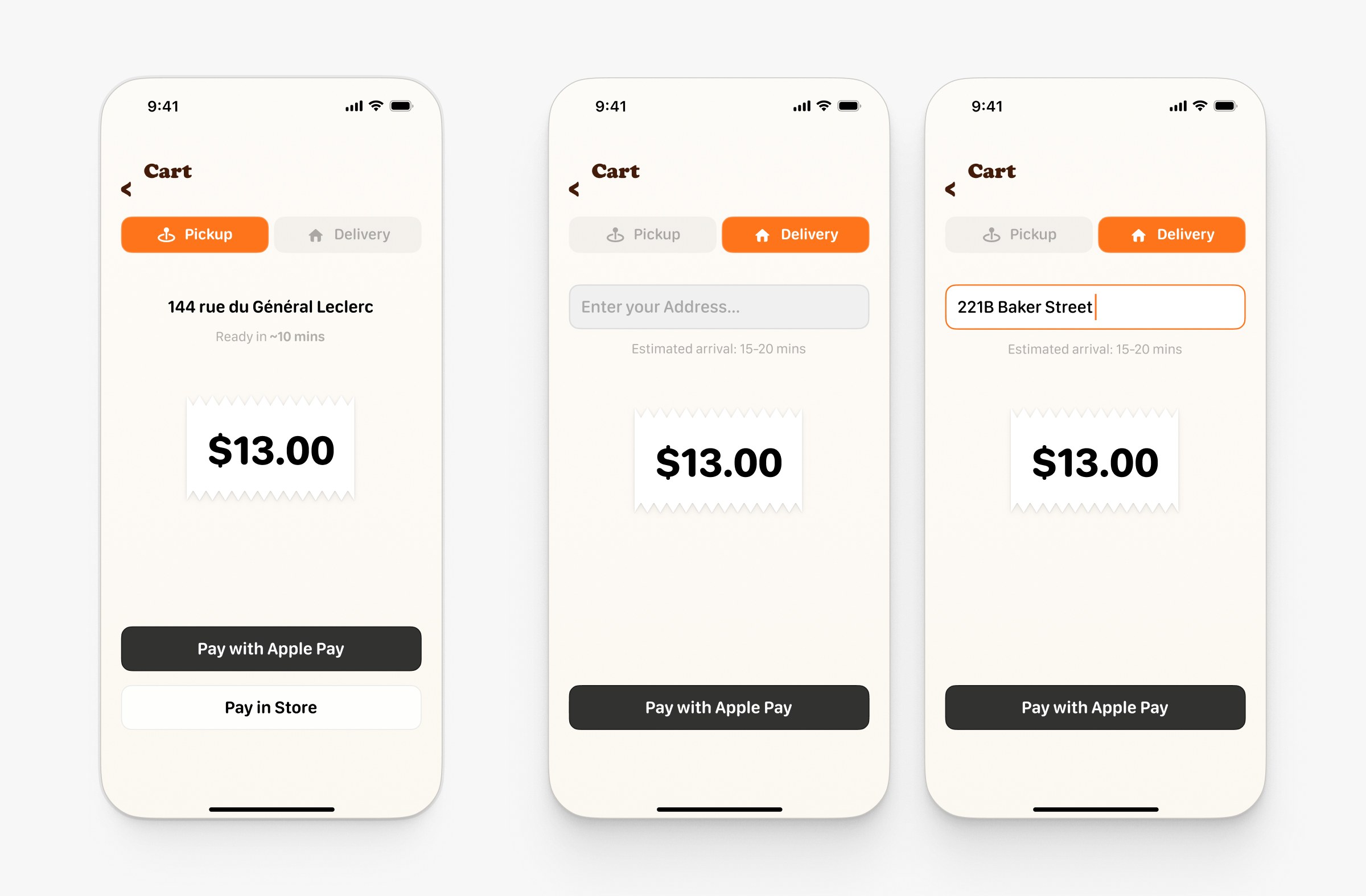
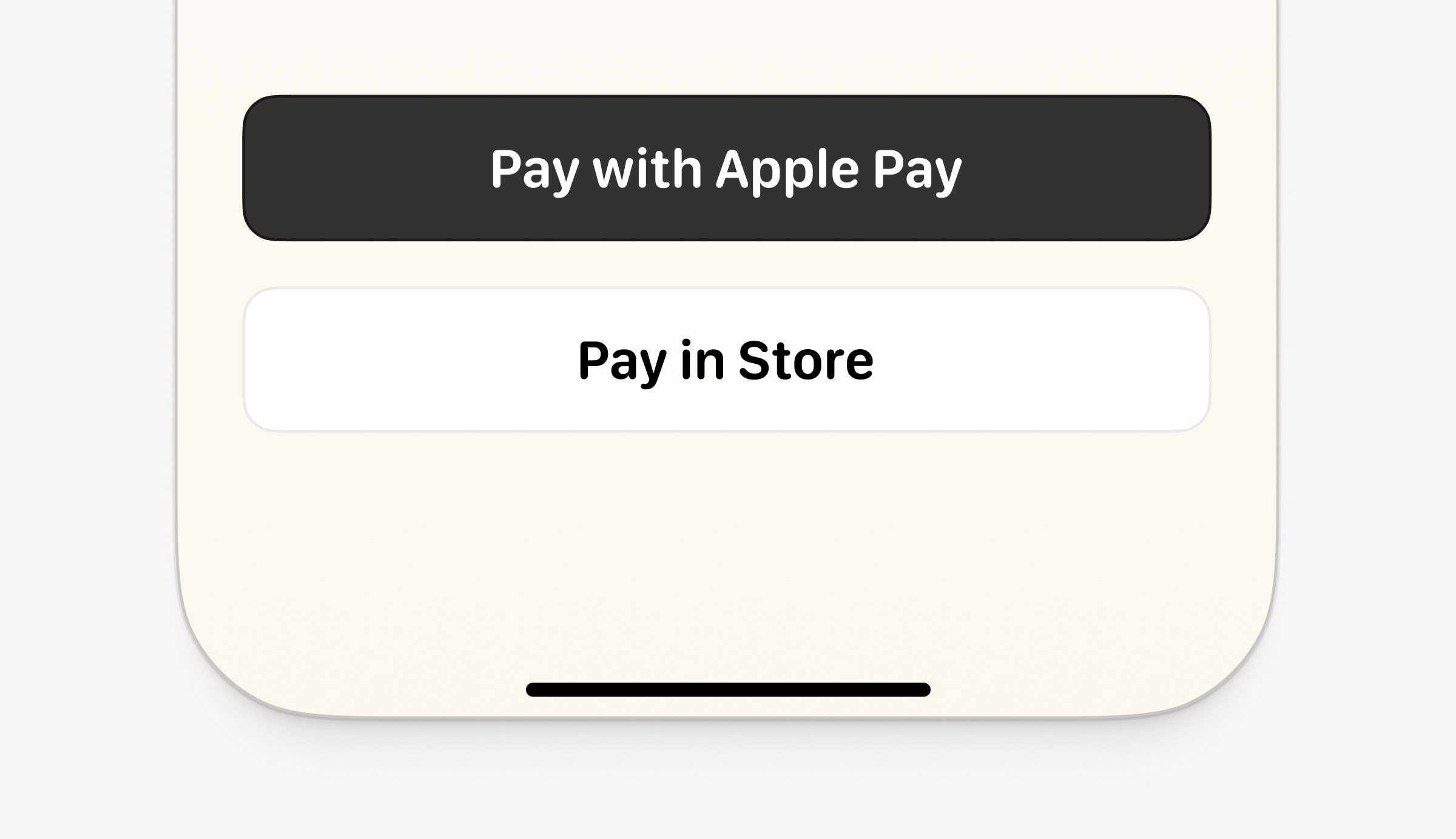
The checkout flow changes based on what the user needs. If they want delivery, they have to enter a valid address before the payment button becomes active. If they choose pickup, the app finds the nearest store and immediately shows quick payment options like Apple Pay.
Cart & Order Tracking
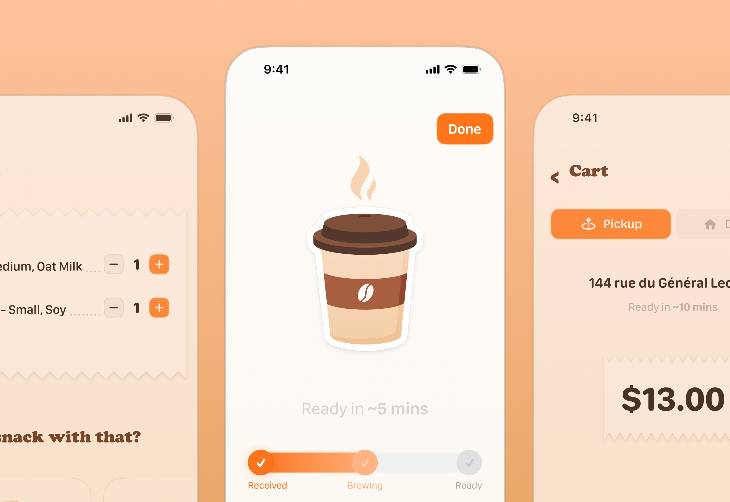
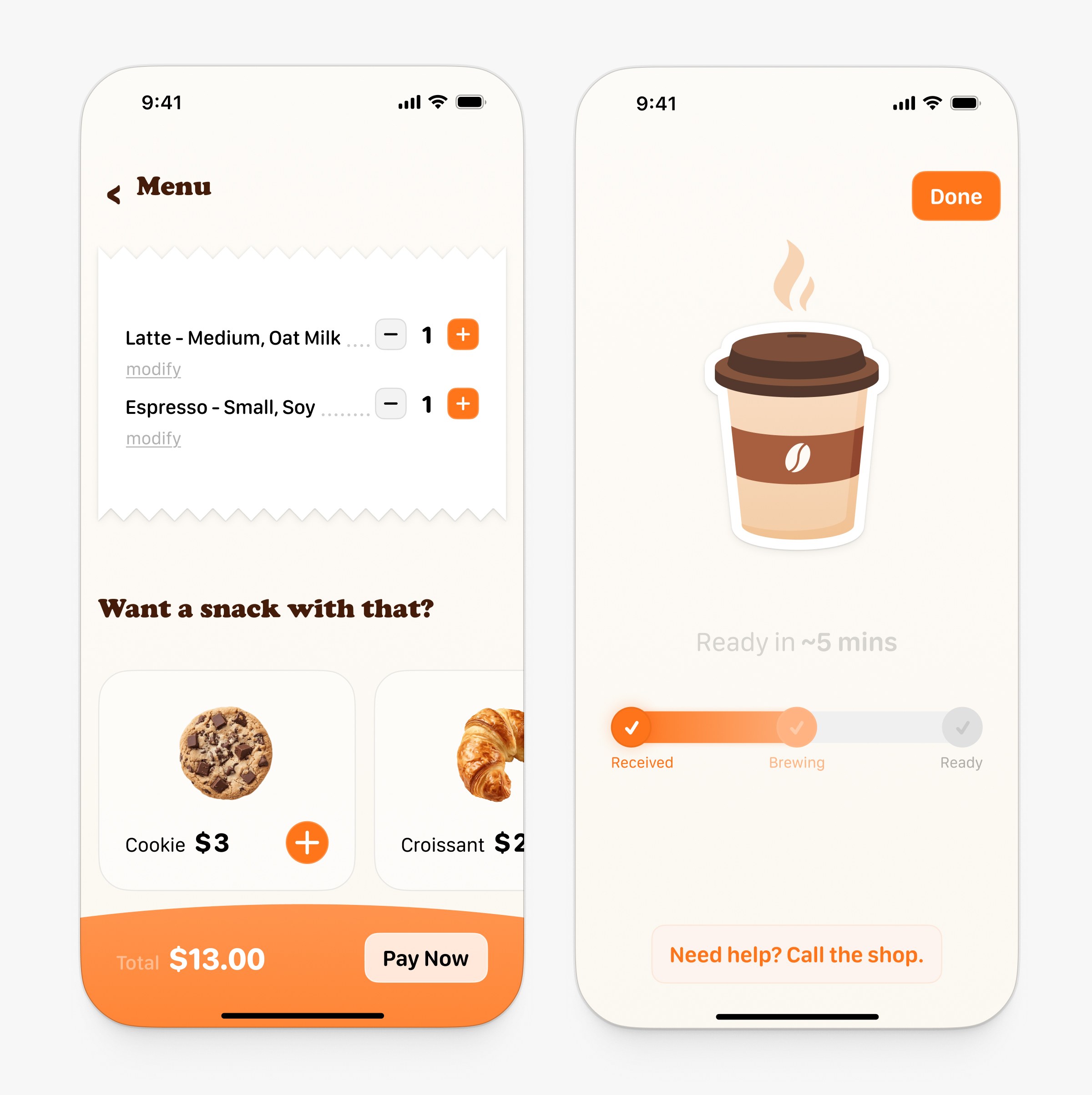
To help increase the average order value, I added a ‘Want a snack with that?’ prompt right in the cart. I also wanted to keep users from worrying after they pay. The app shows a continuous status bar and a three-step visual timeline so they always know exactly when their coffee will be ready.
Scalable Component System
To make all of this work, I built a clean UI kit in Figma. Instead of making dozens of static screens, I used variants and boolean properties. This kept the component library small but flexible enough to handle all the different drink sizes, add-ons, and cart states.