Design Relay
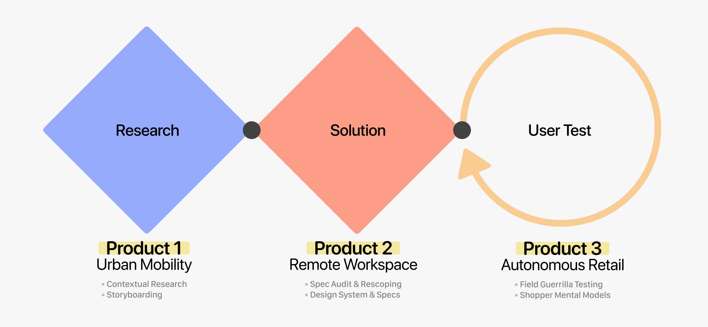
Problem: We needed to rapidly adapt to three different industries (bike security, smart desks, and retail carts) to research, design and test UX concepts within tight academic deadlines.
Outcome: We designed an automated bike lock, built a mobile prototype for a smart desk, and ran a field test that proved a digital shopping cart app wasn't actually useful for real shoppers.
Sprint Context
Following the Double Diamond framework, this project sprint simulated fast-paced agency conditions across three separate product domains. The goal was to adapt to unfamiliar industries, build design systems, and run real-world field tests.
Field Observations
Bike theft results in 400,000 stolen bikes annually in France. To figure out why, we conducted observations and interviews at transit hubs in Bordeaux (Sainte-Catherine Street and Bergonié).
Research Insights
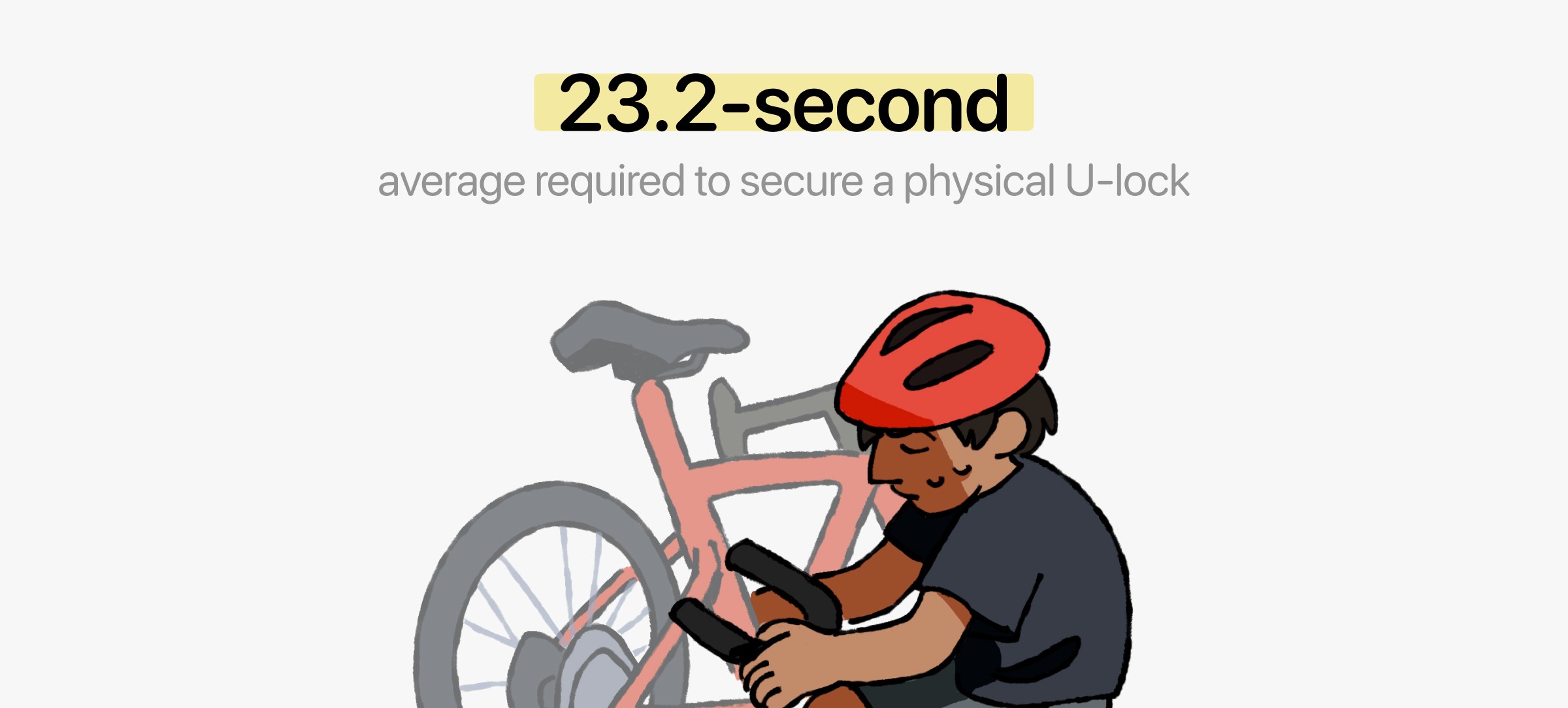
Our research identified micro-stops as a critical vulnerability. Based on this, we mapped out three personas (the delivery driver, the rushed parent, and the determined ecologist). Since it takes an average of 23.2 seconds to secure a U-lock, people making fast stops often skip locking their bikes entirely just to save time
Ideation
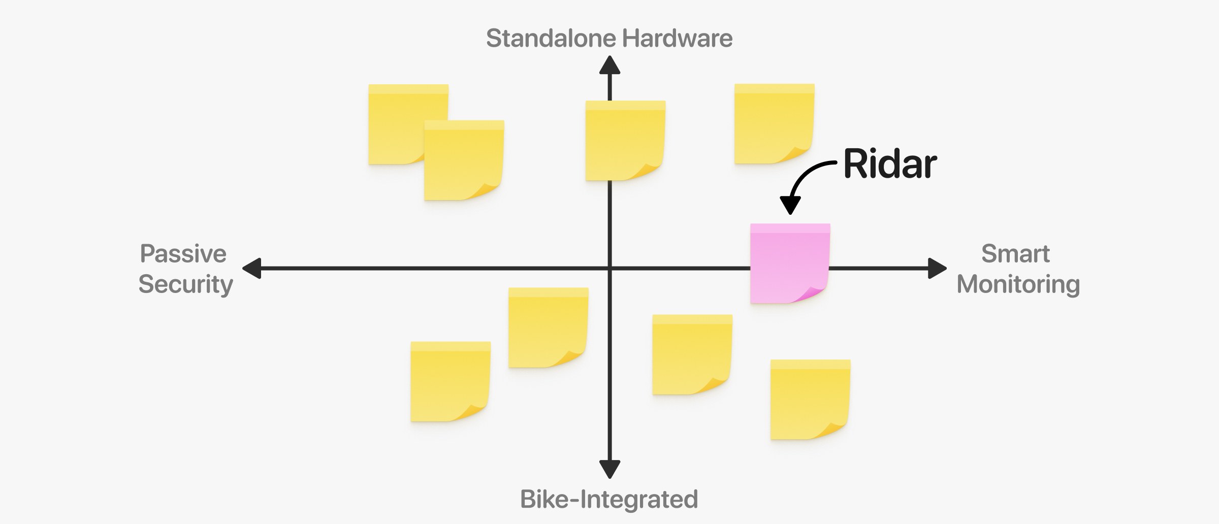
To eliminate obvious concepts, our team ran a 15-minute ideation purge, leaving a dozen viable ideas. We evaluated these on a matrix structured along two axes (Standalone Hardware vs. Bike-Integrated, and Passive Security vs. Smart Monitoring).
Prioritization
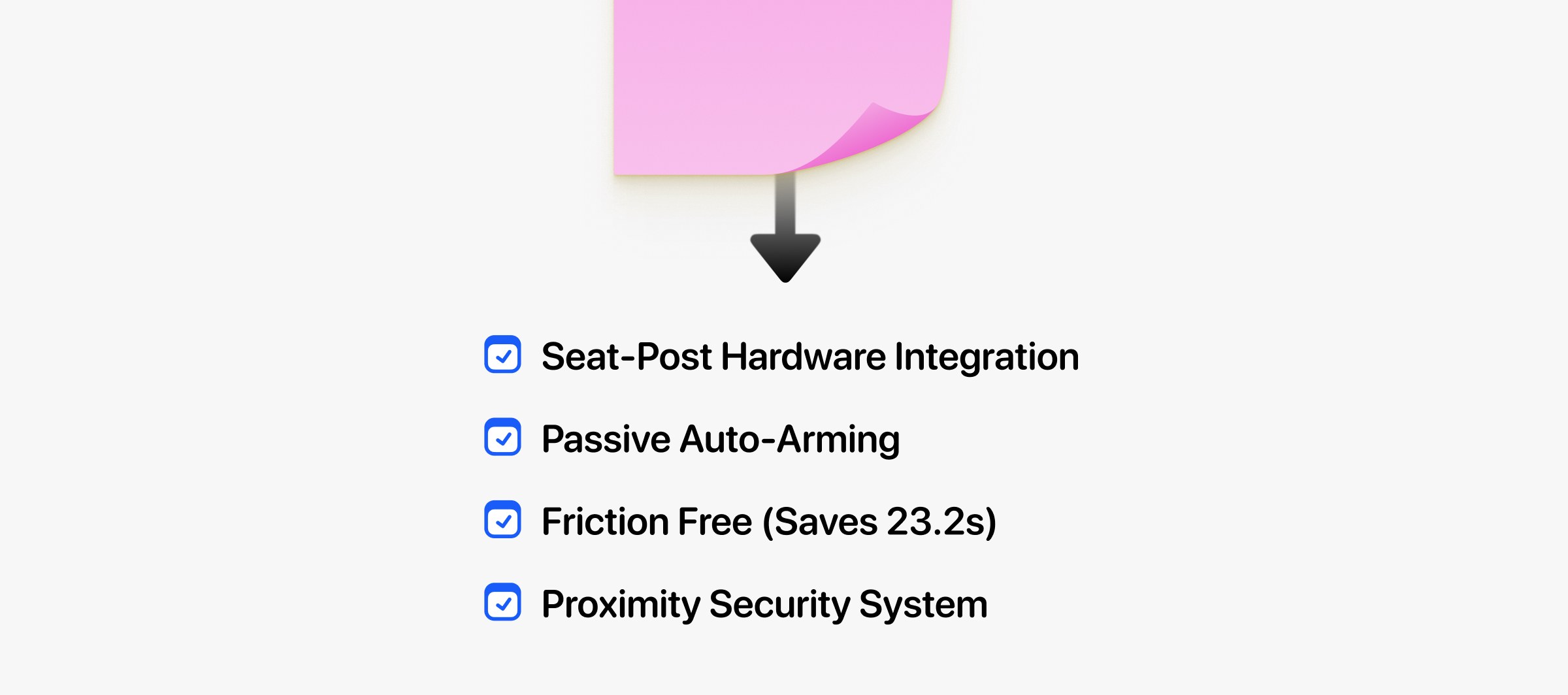
Scoring the surviving concepts on effectiveness, feasibility, and originality led us to Ridar: a phygital security device integrated directly inside the seat post. It auto-arms as the cyclist walks away, eliminating that 23.2-second friction.
Visual Storyboarding
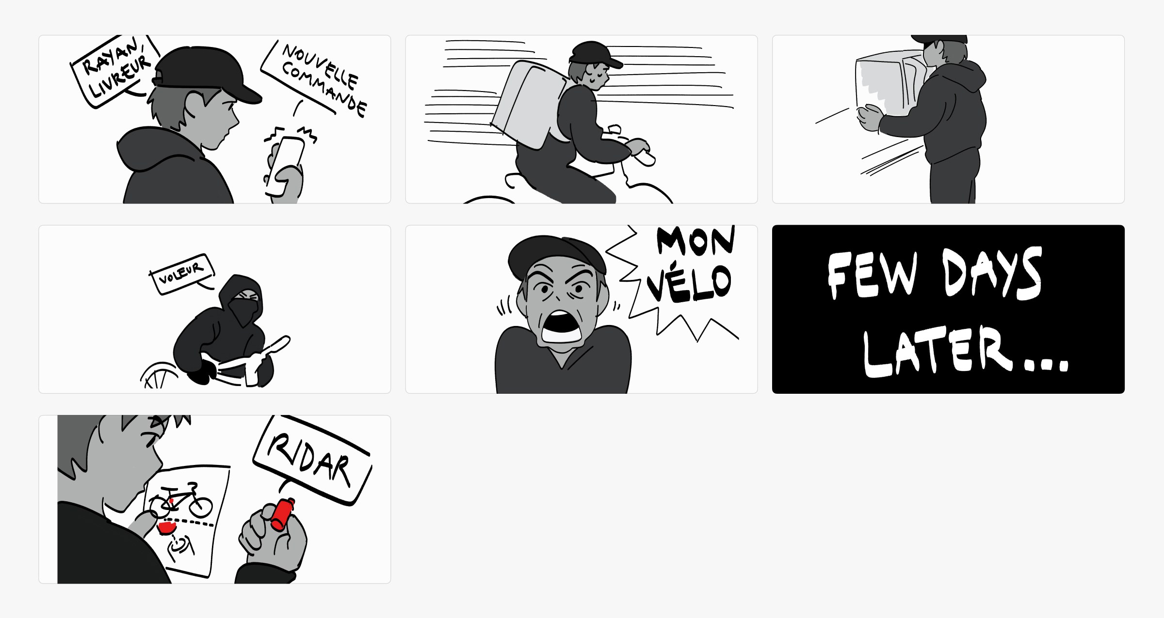
To explain the concept, I illustrated a storyboard centered on a delivery driver persona. It shows how Ridar protects his bike without needing manual interaction during quick pick-ups. The system just works in the background and sends an alert to his phone if someone tries to move the bike.
Rescoping the Brief
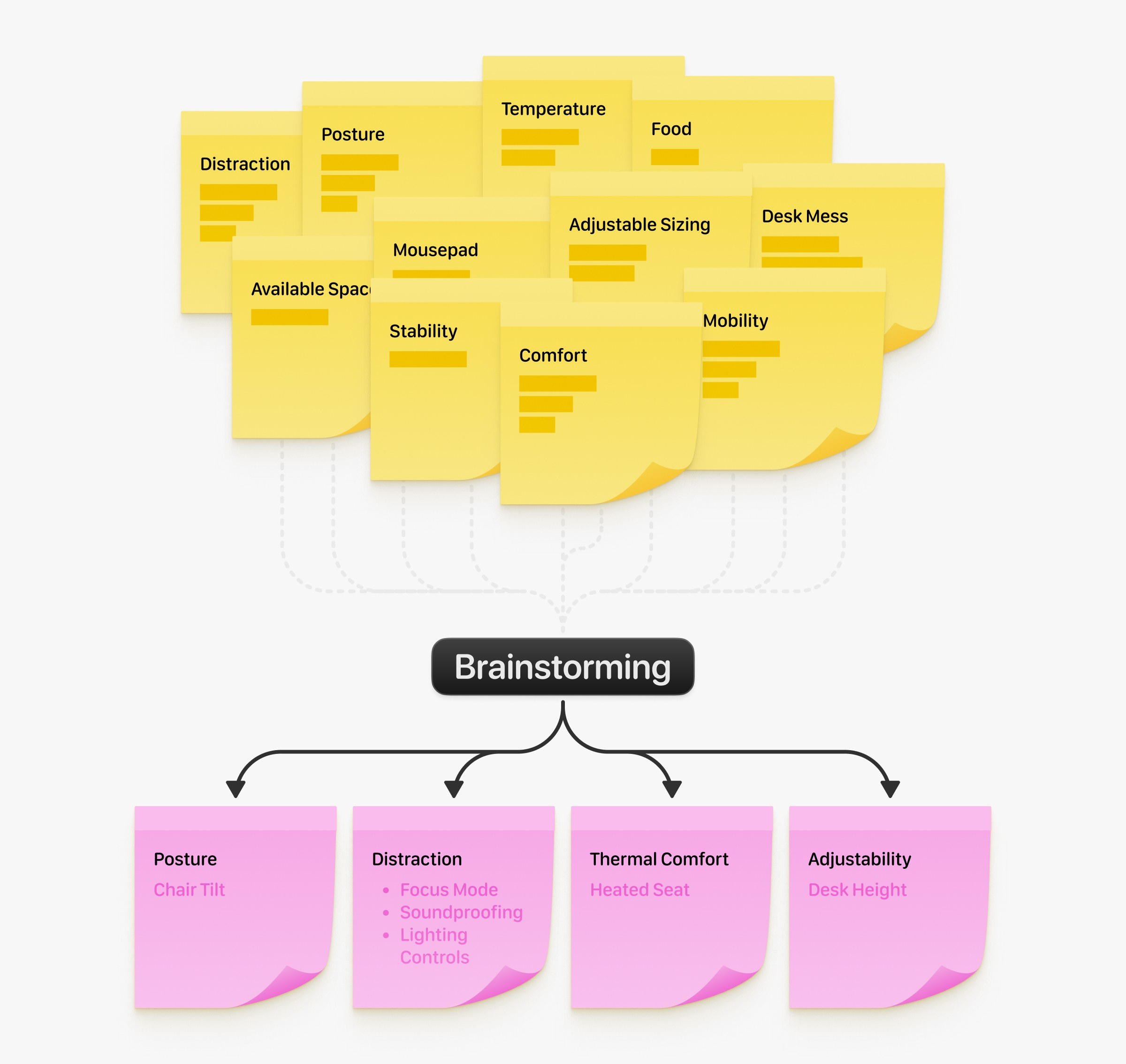
Transitioning to workspace ergonomics, our team inherited a heavy student spec sheet for a smart desk controller that presented 11 fragmented themes (some packing up to three sub-features each). Instead of building a cluttered interface, we ran a workshop to narrow the scope down to four main UX pillars.
Rapid Architecture
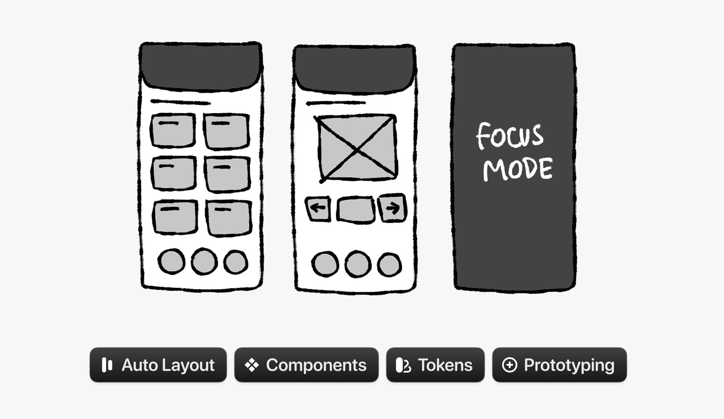
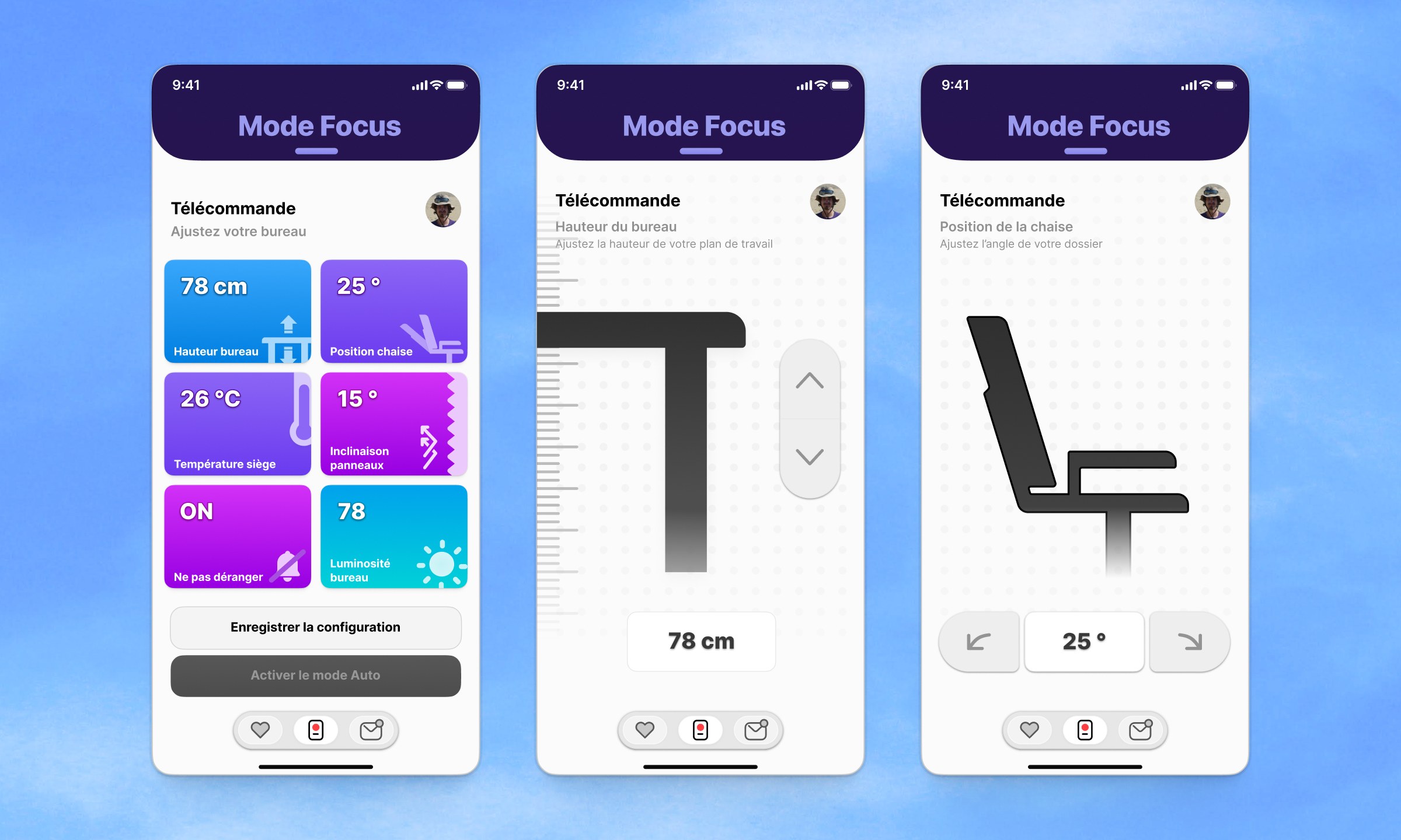
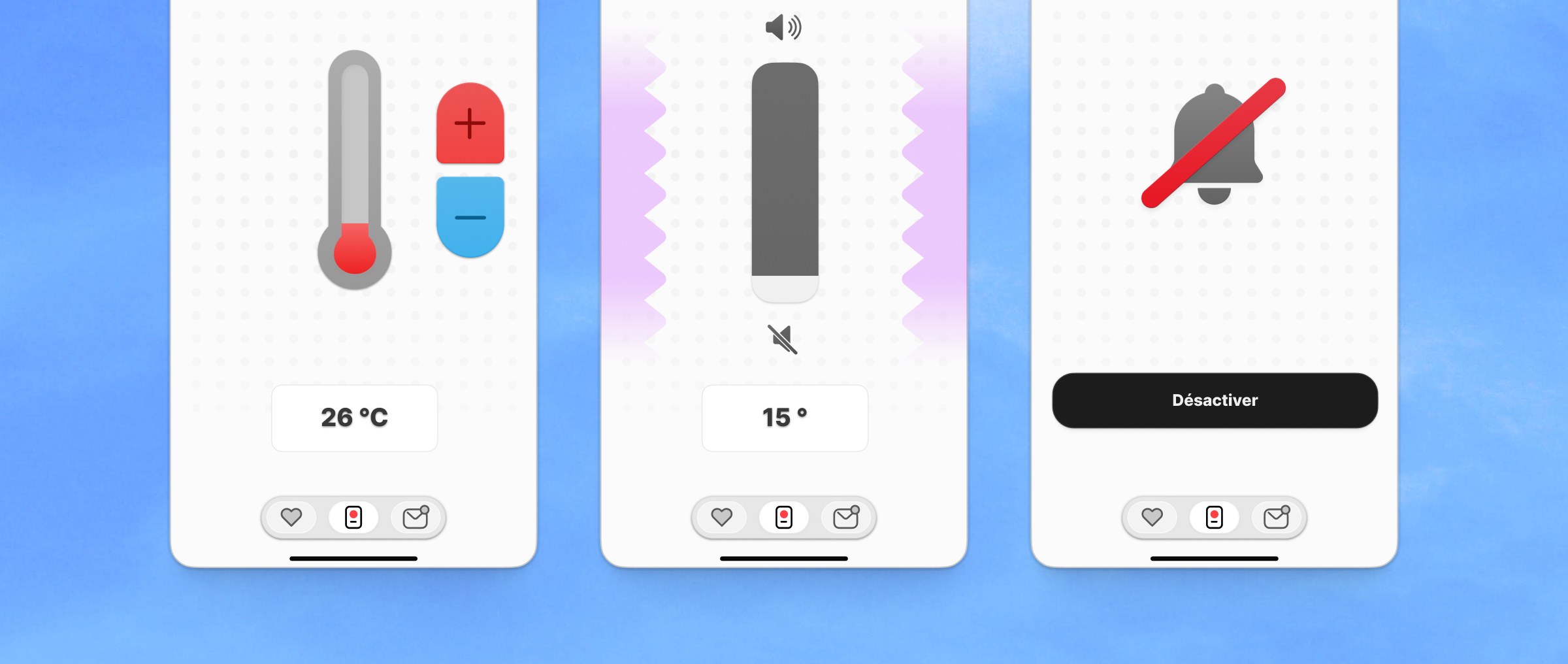
To align the team, we sketched out our ideas on a whiteboard, turning those pillars into a simple control interface with six modular UI cards.
Prototyping
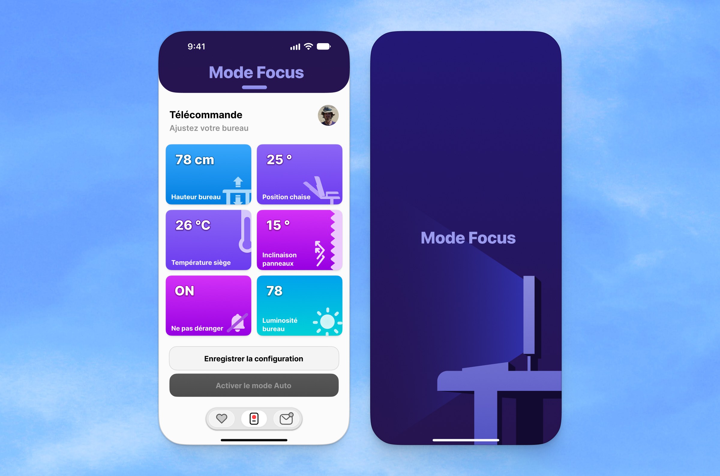
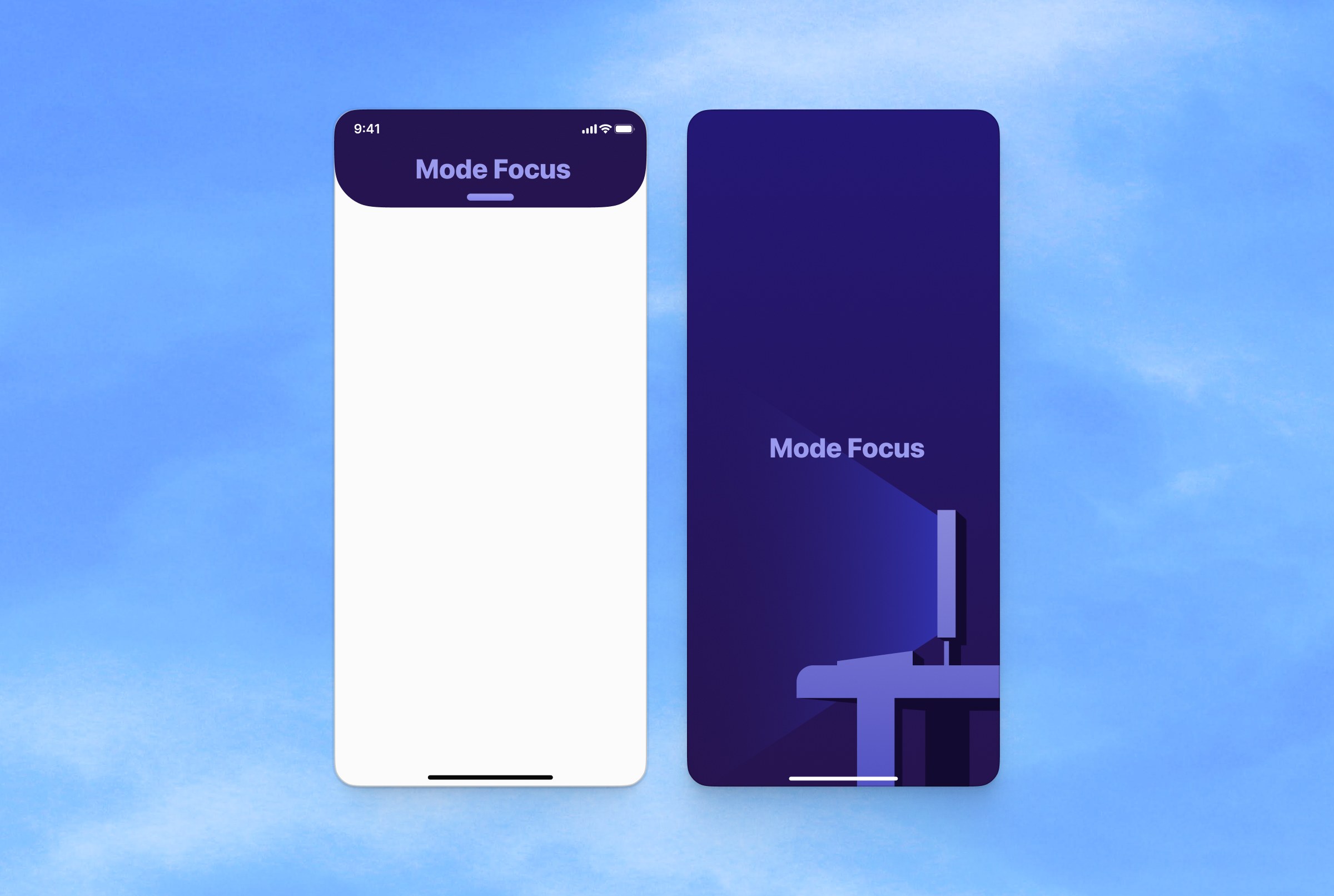
Stepping in as Visual Design Lead, I built the Figma prototype from scratch using Auto layout rules and reusable component libraries. The main feature was a Focus Mode that blocks out notifications and lets you use your phone as a tactile desk remote.
Field Testing
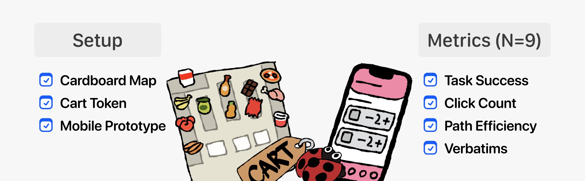
For the final project, we tested another team’s concept for a 100L smart shopping cart. I co-designed a guerrilla usability test at a Leclerc supermarket in Pessac with 9 real shoppers.
To simulate the experience without a real digital cart, we used a Figma prototype paired with a physical cart token and a cardboard store map. Taking advantage of the unbuilt cart to evaluated spatial navigation efficiently.
Findings
Every shopper managed to pair their app with the cart, but the concept itself had flaws. Five out of the nine shoppers instinctively tried to go to a physical cashier instead of using the digital checkout.
More importantly, people preferred their paper grocery lists and felt the app made them “lose the initiative to think”. Shoppers just didn’t see the utility of the app, proving it was a complex solution to a problem that didn’t exist.

Takeaways
Working across three different projects taught me a lot about focusing on what actually matters. On DeskFriend, taking the time to wireframe early saved us from over-designing. And with the Smart Cart, we learned the hard way that a polished UI doesn’t matter if the product doesn’t solve a real user need. Sometimes, realizing people just prefer paper is the most valuable insight you can get.